that is self evident.
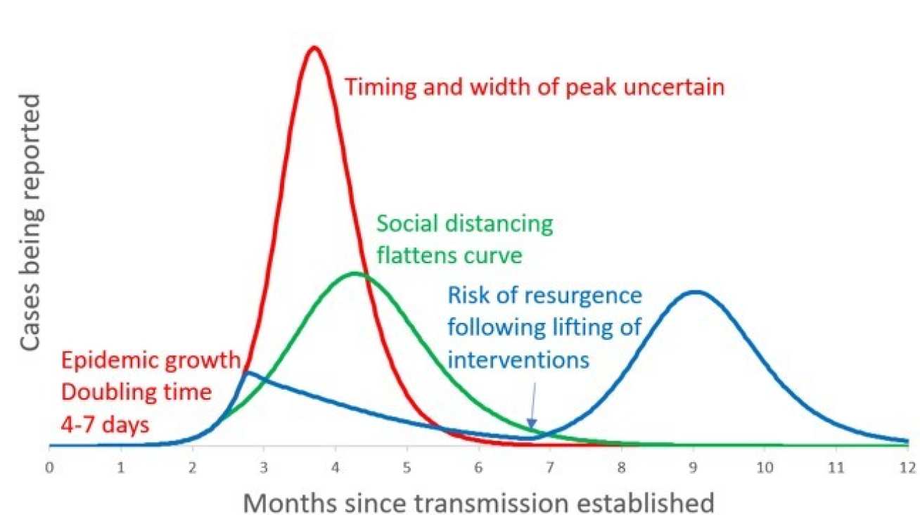
Here is the shape of the two waves that got our government into changing its mind about 'herd immunity', which is illustrated by the red line.
Last week, government asked us for 'social distancing' we were then moved on the green line/
This week, we are in lockdown, the blue line. Add 2 to the months (0 = Feb, 1=March etc 10=December)
To give you an idea of the vertical axis, the first peak of the blue line is as bad as Italy's at the moment. We are just 12-14 days away. The second peak is much higher because there is no way we can have enough beds this winter.
This graph is done by about 100 scientists, mostly @ Imperial College London.


