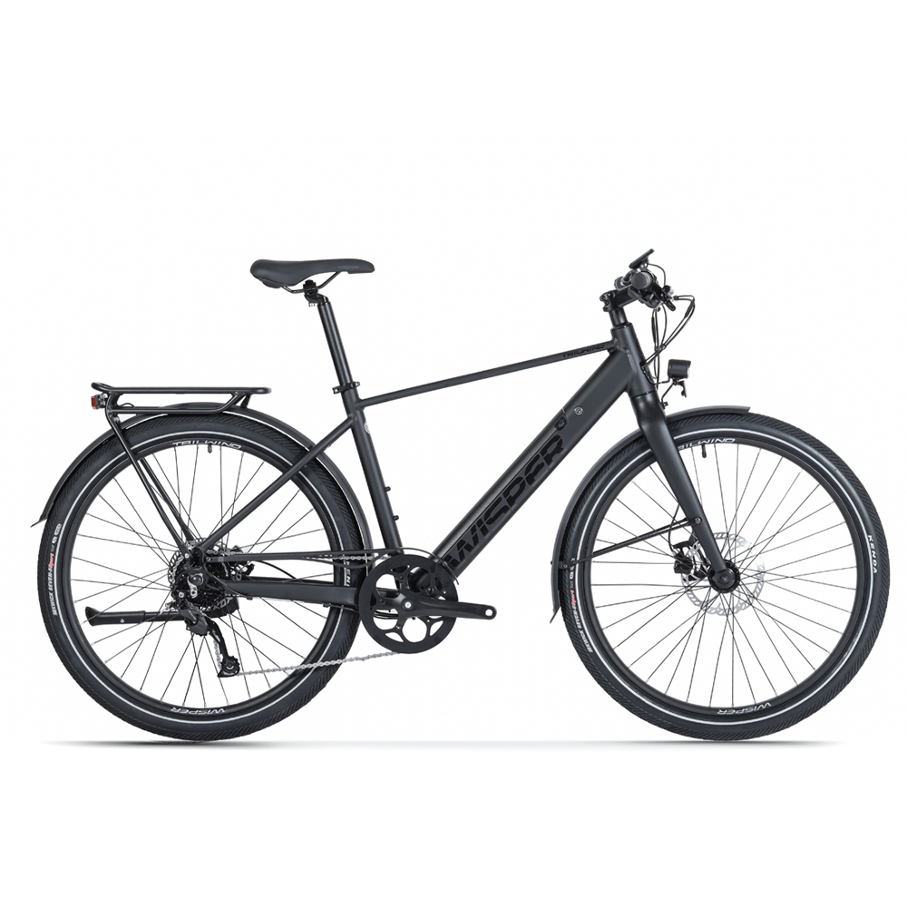
Trying to be helpful and constructive here, but the geometry seems just a little off to me: 1) The quite wide spacing between the rear wheel and seat-tube, and 2) the alignment (head-tube angle) of the front fork relative to that seat-tube seems to be angled inward very slightly rather than parallel or forward facing. Maybe it's just optical, but it just looks a tad "off" and makes the bike appear front heavy IMHO. Is that just me?about the frame: I know I wanted a frame for our traditionally built customers but should I change for something less 'tank' like?
I understand your reasoning for the matt-black colour (one of my own e-bikes is matt black too), but the whole seems a little drab - almost too black and bulky which is what you seem to be thinking? Tan-wall tyres might help, but my guess is that adds cost which you'd want to avoid?
Given other members comments too about adding a splash of colour, maybe you could offer some optional pre-printed/cut designer decals/transfer sheets for owners to add their own stripes/graphics/branding that would break-up all that black? Lots of companies offer competent design and various ways to produce in low-volume geared for ease of user application; it's relatively cheap for you to do and offers owners the option to add some "popping" colour and/or personalise their ride... it could work for all of your other models too (which mostly seem black and devoid of nomenclature!)? It's a thought cribbed from MiRiders limited edition ranges (now discontinued I think) where they simply applied pre-printed graphics to their standard frame-painted models giving 4 or 5 distinct personalities to an otherwise standard design (IIRC one was combat camouflage, one British Union Jack themed, one had bright popping stripes etc. etc.). IIRC they charged an extra £200 for that too!
Just thinking out loud!!
